


Camo Dark Icon Pack
4.591.00 Reviews
App Specs
- Version
- 1.8.0
- Updated On
- License
- $0.69
- Downloads
- 10,000+
- Developer
- Creativepixels
- Categories
- Personalization
- Platform
- Android
Screenshots
 Analysis by AppCompare
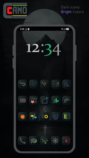
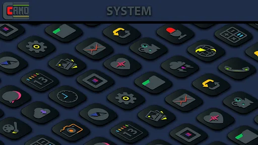
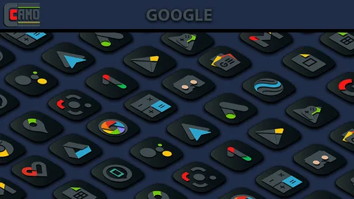
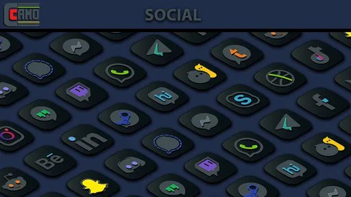
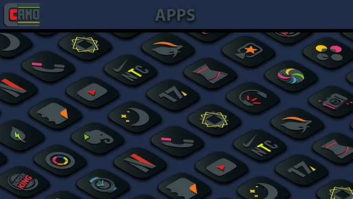
I like icon packs that change the mood of a phone without turning the home screen into a design project. Camo Dark Icon Pack takes that simple approach: it gives supported app icons a very dark, almost black appearance, then adds small bursts of color so the screen does not become completely flat. After using it as a personalization app, I found its appeal is less about decoration and more about creating a consistent visual background for widgets, wallpapers, and a night-friendly setup.
It is made by Creativepixels and is listed as a paid app for $0.69. That puts it in the inexpensive end of Android customization, although the real question is not the price. The important question is whether its particular camouflage-inspired style fits the launcher and apps you already use. If you want every icon to remain bright and instantly recognizable, this is probably the wrong direction. If you prefer a restrained dark screen with occasional color accents, it is much easier to recommend.
How I judged the pack before deciding to keep it
With an icon pack, I do not judge the preview image alone. I look at four practical things: whether the style stays coherent across a mixed app drawer, whether the icons remain easy to identify, whether applying them is straightforward, and whether the result still looks good after the novelty wears off. A dark pack can look excellent in a screenshot and become inconvenient when every symbol blends into the same shadow a few days later.
Camo Dark Icon Pack has a clear visual idea rather than trying to imitate every popular theme. The base treatment is deep black, while selected color details provide separation. That balance matters. A completely monochrome pack can feel elegant but slow me down when I am searching for a familiar app. Here, the color pops act as visual landmarks, especially when the home screen contains several rows of similarly shaped icons.
I also considered how it works as part of a larger setup. The pack makes more sense with a dark or muted wallpaper than with a bright photographic background. On a simple black, charcoal, or low-contrast image, the icons feel intentional. Against a busy wallpaper, the dark shapes can disappear, and the colored details may look like isolated spots rather than a unified design.
The app is available for Android devices running version 5.0 or later, so compatibility is broad in terms of operating-system age. That does not automatically mean every launcher will behave identically. Icon packs depend heavily on the launcher, and the application experience can vary between a launcher with built-in theme support and one that needs a separate customization route. I would check the launcher’s icon-pack settings before buying if your phone uses a less common home-screen replacement.
The visual character is stronger than the name suggests
The camouflage idea is not just a label for a dark color scheme. The icons are designed to recede into the overall interface, which changes how the phone feels when I unlock it. Instead of a row of loud, competing brand colors, the home screen becomes calmer. The few brighter elements guide the eye without making the layout look playful or overly polished.
Worth Reading Before You Choose

EA SPORTS FC Mobile 26 Is a Bigger Football Game, but It Takes Time

Flipboard Shows What News Apps Must Do Beyond the Feed

Switching to Android Auto Means Rethinking Your Driving Routine

Google Calendar Makes a Crowded Week Easier to Manage

Ludo King Makes the Most of the Minutes Between Plans

Baby Panda World Brings Quick Play to Modern Phones, but Its Game Library Feels Busy
That restraint is useful for people who keep several widgets on the first page. A calendar, weather panel, music control, or task widget can remain the main focus while the icons sit behind it visually. I found this especially helpful on a compact home screen where large, colorful icons would otherwise make the page feel crowded.
There is a trade-off, though. The darker the icon treatment, the more important placement becomes. If I scatter icons randomly across a wallpaper with dark areas, some of them lose contrast. I got a better result by using a plain background and grouping the most frequently used apps near the lower part of the screen, where the color accents were easier to scan.
What makes it useful in everyday routines
One realistic use case is a work phone or a personal phone that I check constantly throughout the day. I can put communication and productivity apps on the main page, then move less important entertainment apps to a second page. The pack’s subdued appearance makes the first page feel less demanding, while the accent colors still help distinguish the apps I open repeatedly.
Another good fit is a bedtime setup. I would combine the icons with a dark wallpaper, reduce visual clutter, and keep only essential shortcuts visible. This does not turn the phone into a dedicated focus tool, but it can make the home screen feel less stimulating than a default arrangement full of bright logos. The benefit comes from the complete setup, not from the icon pack in isolation.
A less obvious workflow is to use the pack as a visual reset after reorganizing the launcher. Instead of changing wallpapers, widgets, folders, and icon positions all at once, I can apply the dark icons first and see which parts of the layout still feel unbalanced. The pack exposes spacing problems because its quiet shapes make uneven rows and crowded folders more noticeable.
I also found that the color accents can support a simple grouping system. For example, I can keep frequently used communication apps on one page and utility apps in a folder, then rely on the different accent details as quick recognition cues. This works best when I avoid overfilling the screen. The pack rewards a deliberate layout more than a home screen packed with every installed application.
Where this pack wins over familiar alternatives
Compared with the usual bright, brand-preserving icon packs, this one gives the entire phone a more unified appearance. Standard icons often make each app compete for attention because every developer uses a different color palette. Camo Dark Icon Pack reduces that visual noise without requiring me to redesign the whole interface.
It also has an advantage over fully black-and-white alternatives. Pure monochrome themes can look very clean, but they may remove too many recognition cues. The colored details here create just enough variation for me to find common apps more quickly. That makes the pack a more practical choice for someone who wants a dark aesthetic but does not want to memorize a completely new set of symbols.
Another strength is its narrow focus. Some customization apps try to combine wallpapers, widgets, fonts, and icon styles into one large system. This pack is easier to evaluate because its purpose is concentrated on icons. If I already like my launcher and widgets, I can change the visual language of the shortcuts without committing to a full theme ecosystem.
The price also lowers the risk of trying it. At $0.69, it costs less than many small customization purchases, so the decision mainly comes down to compatibility and taste. I would still avoid buying it solely because the screenshot looks attractive. Icon packs are experienced inside the launcher, and the same design can feel polished on one layout and muddy on another.
The app has an average rating of 4.5 from roughly 492 ratings, with about 91 written reviews. That gives me some confidence that the concept works for a meaningful group of users, but I would treat the rating as a signal rather than a guarantee. An icon pack can be well received overall and still not suit a particular launcher, wallpaper, or preference for high-contrast icons.
Where another kind of icon pack may fit better
I would choose a brighter, more recognizable pack if I use my phone while walking, commuting, or multitasking and need to identify an app immediately. The dark treatment is calmer, but calm is not always the same as efficient. People with visual difficulties or anyone who prefers strong contrast should test the appearance carefully before making it the main interface.
A colorful pack may also be better for children, shared devices, or phones used by several people. Camo Dark Icon Pack assumes that the owner wants a particular visual mood. It is less suitable when instant recognition matters more than consistency or when different users need obvious app branding.
On the other hand, a fully monochrome pack may suit someone who wants an even stricter minimalist look. Camo Dark Icon Pack keeps vibrant details in the design, so it is not the right choice for a completely uniform black-and-white setup. Its appeal depends on that contrast; remove the color and the reason to choose this particular style becomes weaker.
I would also consider a launcher’s own icon styling if I want the least possible setup work. Built-in options can be more convenient because they are already integrated with the home screen. The advantage of a dedicated pack is the stronger, more specific visual identity, but that comes with the need to apply it through the launcher and possibly adjust the layout afterward.
Practical friction before and after applying it
The first thing I would check is whether my launcher supports third-party icon packs directly. On a compatible launcher, applying a pack is usually a matter of opening the launcher’s appearance or icon settings and selecting it. If that option is missing, the pack may not fit my current setup without changing launchers, and that is a much bigger commitment than paying for a small personalization app.
I would also inspect the home screen after applying the pack rather than assuming the result is finished. I look for icons that appear too dark against the wallpaper, folders that lose their visual hierarchy, and widgets whose colors now clash with the new accents. A plain wallpaper and a little rearranging often make a larger difference than adding more customization.
One useful approach is to start with a single home-screen page. I would keep the default arrangement available on another page, apply the pack to the main page, and use it for a day. That makes the decision practical: I can see whether the icons remain recognizable during real use instead of judging them only during setup.
The cost of switching is small if I already use a launcher with icon-pack support. I can change the icon style, adjust the wallpaper, and return to the previous look if it does not work. The cost becomes higher if I need to replace my launcher, rebuild folders, or give up gestures and behaviors that I rely on. For that reason, launcher compatibility is more important than the low purchase price.
There is also a maintenance consideration. When I install a new app, its icon may not immediately fit the visual language I have chosen. That can create an awkward mixture of dark themed icons and ordinary bright ones. Before committing to the pack, I would decide whether I am comfortable with occasional mismatches on a growing app drawer. A carefully curated first page can hide that issue, while a page showing every installed app cannot.
Who will appreciate the dark camouflage approach
This is a strong match for someone who already enjoys dark mode, muted wallpapers, and a tidy launcher. It is particularly appealing if the phone is used as a quiet tool rather than a display of colorful app branding. The design can make a small screen feel more composed and can help widgets or a chosen wallpaper take the leading role.
It is also a good option for a person who wants a noticeable refresh without learning a complicated customization system. The visual change is immediate, but the setup can remain simple if the launcher supports icon packs. The low cost makes experimentation reasonable for users who are curious about dark personalization and do not want to buy a large theme bundle.
I would skip it if I strongly depend on the original colors and logos of apps, if my launcher does not support external icon packs, or if my wallpaper is already very dark and detailed. I would also skip it if I want a playful, expressive, or highly colorful home screen. This pack has a specific personality, and forcing it into the wrong environment will make the phone look less clear rather than more stylish.
Version, maturity, and the buying decision
The current version is 1.8.0, and the app was released on February 3, 2021. Those details suggest a product with an established presence rather than a brand-new experiment. For me, that makes the purchase feel easier to place: I am choosing a defined visual style, not buying into a promise of a future redesign.
It is rated for Everyone, which fits the nature of the app. This is a visual customization tool rather than a service built around social interaction or mature content. I would still focus more on launcher support and icon visibility than on the age label, because those are the factors that determine whether it improves my daily experience.
After weighing the alternatives, I see the purchase as a style decision with a low financial barrier but a potentially meaningful setup effect. The best result comes from treating it as one part of a layout: choose a restrained wallpaper, leave enough empty space, group essential apps thoughtfully, and avoid judging the pack while the screen is still cluttered with default widgets.
My recommendation is positive for the right user. I would suggest Camo Dark Icon Pack to anyone who wants deep, subdued icons with enough color to preserve recognition, especially on a compatible launcher and a dark, uncluttered home screen. I would not recommend it as a universal replacement for every Android user. The style is too deliberate for people who prioritize maximum contrast or familiar app colors.
In my experience, its strongest quality is the balance between visual quiet and useful distinction. It does not merely make icons dark; it changes the hierarchy of the whole home screen, allowing selected widgets and shortcuts to stand out. If that is the kind of change you want, the small price is easy to justify. If you are hoping for a full customization suite or a brighter, instantly recognizable interface, another category of icon pack will serve you better.
Pros
- Includes a broad selection of dark-themed icons for popular apps.
- Consistent black-and-gray style gives home screens a polished appearance.
- Alternative icons make it easy to personalize compatible launchers.
- Lightweight design should have little impact on device storage.
- Works well with dark wallpapers and system themes.
Cons
- Some less popular apps may not have a matching custom icon.
- Requires a compatible launcher for full icon replacement features.
- Icon requests may take time to appear in future updates.
- Certain widgets and system icons may retain their original style.
- Dark icons can be harder to distinguish on very dark wallpapers.
FAQs for Camo Dark Icon Pack
What is Camo Dark Icon Pack?
Camo Dark Icon Pack is a customization app designed to give compatible Android devices a darker, camouflage-inspired visual style. It replaces supported app icons with coordinated dark-toned designs, helping create a more consistent home screen. The pack may also include wallpapers and alternative icons, depending on the version, but its main purpose is improving the appearance of your launcher.
Which launchers are compatible with Camo Dark Icon Pack?
Compatibility depends on the launcher installed on your device. Camo Dark Icon Pack generally works with popular third-party launchers that support icon packs, such as Nova Launcher, Lawnchair, Smart Launcher, Apex Launcher, and similar options. Some phone manufacturers’ default launchers may not support external icon packs directly, so you may need to install a compatible launcher before applying the icons.
How do I apply Camo Dark Icon Pack to my home screen?
After installing the app, open Camo Dark Icon Pack and look for the apply option or supported launcher list. Select your launcher, then confirm the change. You can also open your launcher’s settings and choose the icon-pack section manually. If some icons do not change, use the pack’s icon request or manual replacement tools, when available, to customize unsupported applications.
Does Camo Dark Icon Pack include icons for every application?
No icon pack can guarantee coverage for every application, especially newly released or less popular apps. Camo Dark Icon Pack may support many commonly used applications, but some icons can remain unchanged if they are not included. In that situation, you may be able to replace icons manually, use an alternative icon from the pack, or request new designs from the developer.
Is Camo Dark Icon Pack free to use, and does it affect phone performance?
The availability of free features, premium content, advertisements, or in-app purchases depends on the current version distributed through the app store. Applying an icon pack normally has little effect on performance because it mainly changes visual assets, although launchers may use some additional storage or memory. Users should check the store listing for pricing, permissions, and device requirements before downloading.


